Increasing conversion rate by 21% and decreasing tickets to Support by 48%
The goal of this project was to increase conversion at CFI e-learning dashboard. I addressed this project by collaborating with product and engineering. I discovered user needs and communicated them through design updates on the CFI free learner dashboard leading to 21% subscription rate increase.
September — October 2023


/ my role
My role in this project was to find ‘easy wins’ to increase conversion by making changes around the free learner dashboard. To achieve this I identified key user needs through the research and designed changes for better outlining benefits of paid plan.
/ What is cfi
Corporate Finance Institute (CFI) provides online courses and certifications to people in finance and banking using its own e-learning dashboard
My focus was to communicate to Free learners the benefits of all paid features CFI offers.
/ challenge
Free-to-paid B2C conversion was lower than expected
In Q2 2023 our subscription rate was at a lower level than we wanted. That is why one of the key projects for Q3 2023 was to find the opportunities on how Product team can increase subscription rate.
/ outcomes
21% conversion rate increase
Free-to-paid conversion in Aug, Sep, Oct was 3.3% and after design changes conversion raised to 4%.
3% more customers convert in one hour
Before design updates 27% of customers converted within one hour. After design updates were released 30% of customers converted within one hour.
48% decrease in Support tickets
Before design updates Customer Support received 337 tickets on the topic “Where to get started as a free learner”. After design updates Customer Support received 164 tickets on the same topic.
40% downloads increase of the key CFI feature (templates for Excel)
Within 3 moths before design updates 8,126 learners downloaded excel templates. Within 3 moths after design updates this number increased to 13,537.
/ part 1
/ Research #1: Free learners survey analysis
61% of free users preffered having guidance from CFI


/ Design update #1
In collab with Product Manager I added a 3-step guide to the homepage helping learners getting started with CFI
Step 1
Start a free course
According to survey results 60% of learners are interested in individual courses.
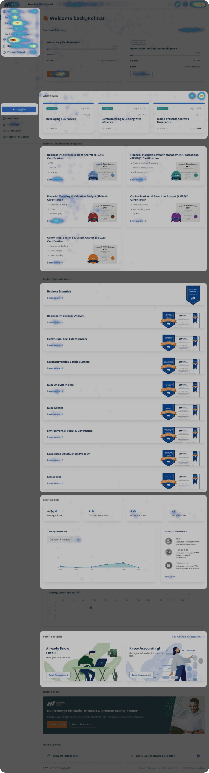
From heatmap (see below) I noticed that courses page was clicked the most in the menu.
Step 2
Take assessment
According to survey results 61% of learners are not sure where to begin, so I highlighted a free “Skills Assessment” tool to help them get started.
Step 3
Download excel template
To increase discoverability of one of key free features I added a link to it on the homepage.

/ part 2
/ Research #2: Homepage heat maps analysis
Content on the homepage was not relevant to free learners and, thus, got abandoned fast
Using heatmap I analyzed clicks on the homepage and identified areas where learners do not click and, thus, those sections should be either re-designed or replaced.
Menu gets the most clicks. Learners were not clicking around the homepage, but instead going to courses page.
Low clicks on ‘Upgrade’ CTA meaning that learners have no interest in finding more about paid features
What’s New section despite being at the top of the page gets low clicks.
Specializations section is lengthy and each specialization lacks description
Insights section is hidden far below in the page and barely has any clicks
Skills Assessments despite being a free resource gets no clicks probably due to being at the bottom of the page.
Certifications program that interests 61% of learners (survey analysis) gets some clicks
Show highlights
/ Design update #2
In collab with instructors we added welcome video to the homepage to increase learner engagement
Due to lack of visibility great free resources such as Skills Assessments and Excel Templates were missed by free users.
I enhanced the discoverability of a free excel templates by adding a link to it on the homepage, which increased templates discoverability by 47%.
To increase engagement on the homepage we added a 2-minute video welcoming new learners to CFI and inviting them to start their learning journey.
Added welcome video to increase engagement
In the previous design skills assessments were down at the bottom, because it’s a free tool helping learners get directions from CFI, I brought it to the top.
Instead of keeping What’s New that was getting low clicks I brought Templates to the homepage, which is one of key free tools CFI has to offer.
I kept the section with certifications untouched as it was getting a good number of clicks
To give learners a better understanding of paid plans benefits I created a card with a short description of each benefit and a link to try it out.
Scroll down to see the design process of this section.

/ Design process
Scroll right to see more ->

Iteration 1: Comparison table looks rather like a pricing plan, to shift from this style I restructured the section with benefits list.

Iteration 2: After talking to my Product Manager we came to a decision that one short line of text won’t be enough to describe paid feature benefit.

3rd iteration
/ part 3
/ Research #3: Paid features access analysis
Absence of paid features preview lead to lack of reasons for upgrading
Free users upon clicking on paid features got a blocking pop-up modal. Without having a possibility to try or preview paid features learners did not have a motivation to upgrade.

/ Design update #3
In collab with Engineers I added preview of paid features providing free learners with a better idea on how they can benefit from paid subscription
/ Choosing the concept
I recommended modifying a paid feature page towards free users making it preview and including a call-to-action to upgrade
While seeking the optimal solution, I came across the design of how paid feature page looked like for paid learners. I suggested my manager to utilize same page style, but make it ‘preview’ mode for free learners with a call-to-action allowing them upgrade to a paid plan immediately. My manager liked the idea and also suggested adding a description to better outline benefits of paid feature.

Paid feature page from paid subscriber viewpoint
/ Before & After
Before design update upon clicking on paid feature free learners were getting blocking pop-up modal. After design update learners got a ‘preview’ mode showcasing how they can benefit from paid features helping them making a better decision on upgrading.

Before: blocking pop-up modal

After: preview mode with description
/ outcomes
21% conversion rate increase
Free-to-paid conversion in Aug, Sep, Oct was 3.3% and after design changes conversion raised to 4%.
3% more customers convert in one hour
Before design updates 27% of customers converted within one hour. After design updates were released 30% of customers converted within one hour.
48% decrease in Support tickets
Before design updates Customer Support received 337 tickets on the topic “Where to get started as a free learner”. After design updates Customer Support received 164 tickets on the same topic.
40% downloads increase of the key CFI feature (templates for Excel)
Within 3 moths before design updates 8,126 learners downloaded excel templates. Within 3 moths after design updates this number increased to 13,537.