Wordbook: phone app for advanced language learners
April to June 2020
April to June 2020
April to June 2020
Crafting from scratch a phone app in a team of five for advanced language learners to create a custom dictionary and take practice tests. Got 4.4 rating in App Store and was downloaded ~125 times a month.
Crafting from scratch a phone app in a team of five for advanced language learners to create a custom dictionary and take practice tests. Got 4.4 rating in App Store and was downloaded ~125 times a month.
Crafting from scratch a phone app in a team of five for advanced language learners to create a custom dictionary and take practice tests. Got 4.4 rating in App Store and was downloaded ~125 times a month.
Overview
Overview
Team
Team
UI/UX Designer (me)
Graphic Designer
Software Engineer
Copywriter
Art Director
UI/UX Designer (me)
Graphic Designer
Software Engineer
Copywriter
Art Director
UI/UX Designer (me)
Graphic Designer
Software Engineer
Copywriter
Art Director
I initiated the project and was driving Wordbook’s user experience decisions based on research discoveries.
I initiated the project and was driving Wordbook’s user experience decisions based on research discoveries.
I initiated the project and was driving Wordbook’s user experience decisions based on research discoveries.
My role
My role
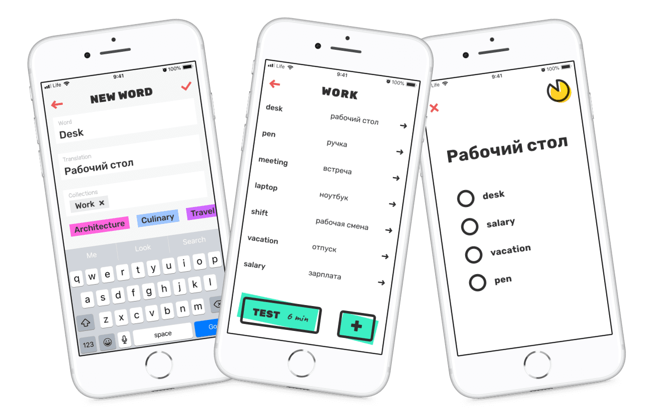
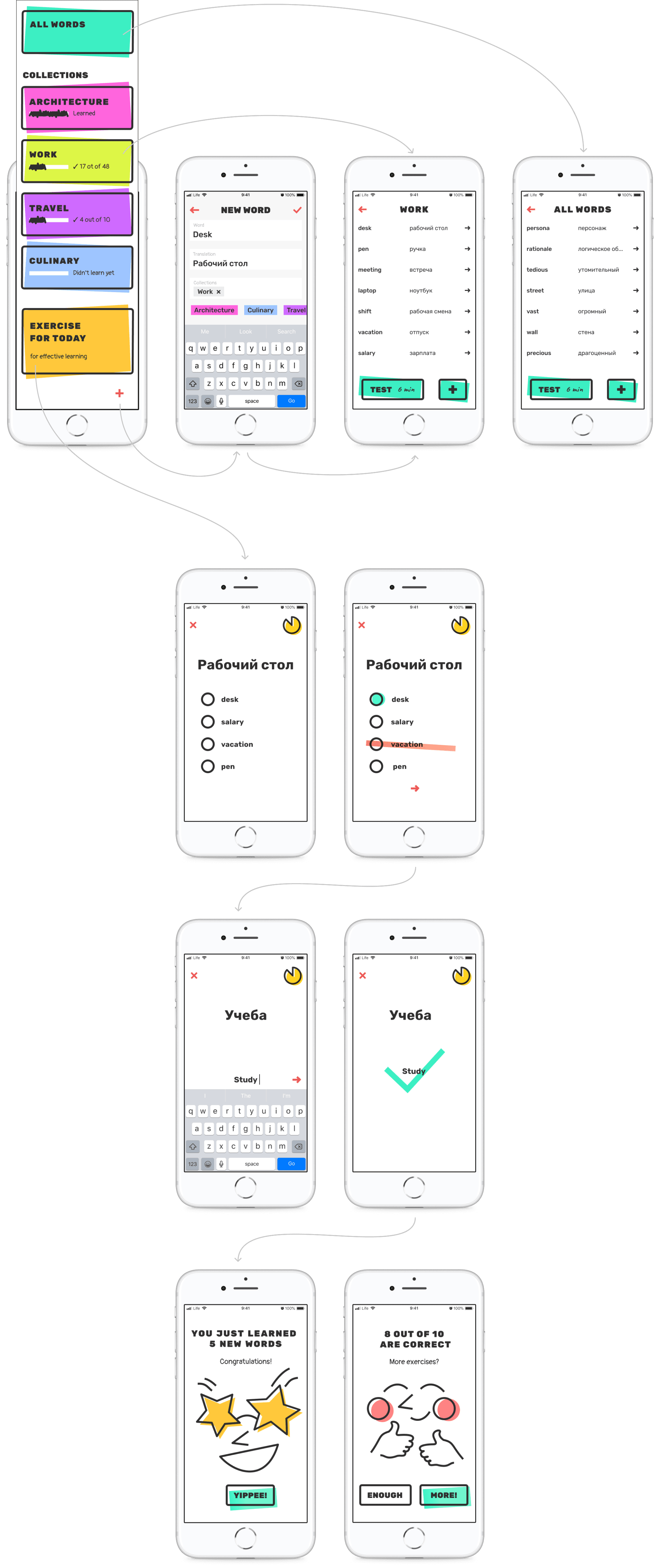
Want to get a glimpse of the project?
Here are key screens I worked on
Want to get a glimpse of the project?
Here are key screens I worked on
Want to get a glimpse of the project? Here are key screens
I worked on

Homepage

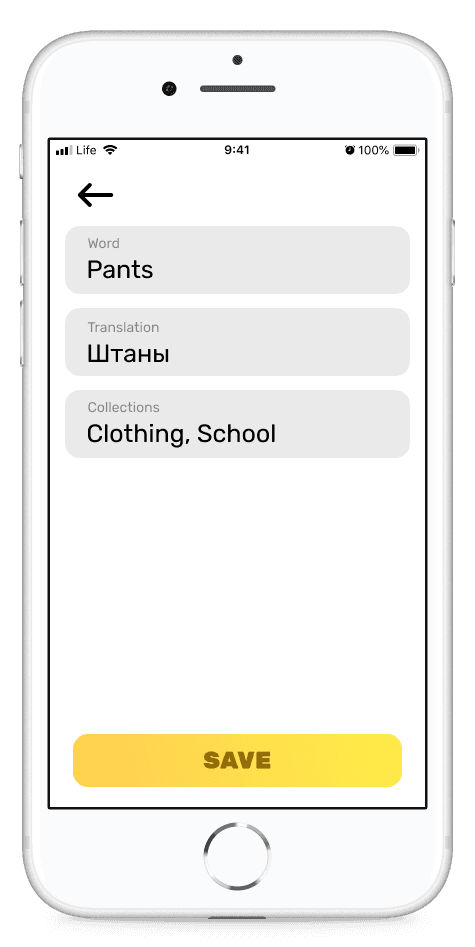
Adding new word to the dictionary
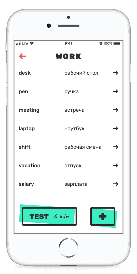
List of words in collection

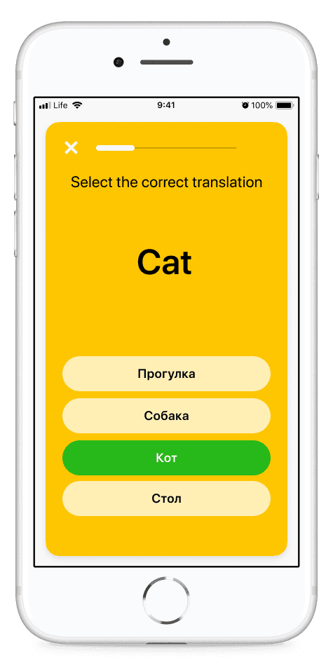
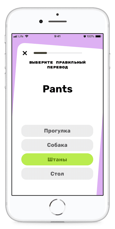
Knowledge test

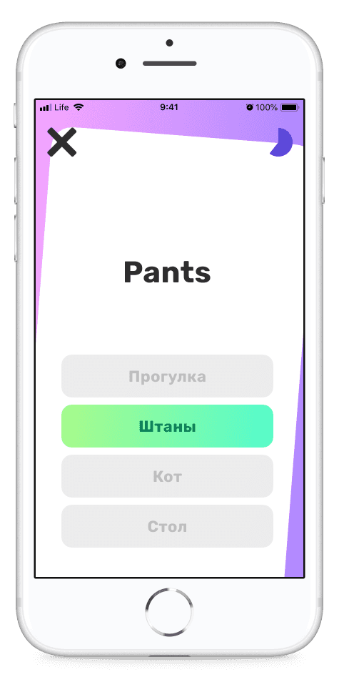
Final screen of the test
List of words in collection
Problem
Another language learning app? Problem is that many learning apps do not give a possibility to create a personal dictionary
Numerous apps offer selections of in-app words such as Duolingo, Easy Ten, etc. However, some people want to create personalized dictionary and add their own words and phrases there. Those people are students who learn words from textbooks, people who work with tutors, those who learn professional vocabulary.
Collaboration
Before we dive into design process, lets talk about collaboration in a team of five
We were working in a team of five. I broke down out work process into 4 stages.
Step
Goal
Team
How we achieved the goal
1
2
3
4
Do research and come up with design concept
Finalize design and hand off to Software Engineer
Beta usable version of the app
Launch the app in
AppStore
Conduct research, sketch, brainstorm, work on design layouts and text, prototype
Art Director gets actively involved in the process by helping us to come up with a neat design solution. In collaboration with a graphic designer we come up with the unique UI style. I finalize the UX and layout of the app create design prototype. In collaboration with copywriter we come up with engaging titles, CTAs and descriptions.
Developer makes our layouts real, we test them using Test Flight. I cooperate closely with an Engineer by proving comments, adjusting some design layouts, informing about bugs. The outcome of this step was having Test Flight prototype working according to the design.
Work on bugs, make minor changes to the design, test UX, create preview images for AppStore
UI/UX Designer
Graphic Designer
Copywriter
UI/UX Designer
Graphic Designer
Copywriter
Art Director joined
UI/UX Designer
Graphic Designer
Copywriter
Developer joined
UI/UX Designer
Graphic Designer
Copywriter
Art Director joined
Developer joined
FFF
We used FFF approach to launch our product on time
FFF stands for a fixed time, fixed budget, flex scope. This means that we cannot go over the budget limit as well as change the product launch date. However, we can waive from some features and implement only the most essential functions in order to finish the project before the deadline.
Fixed time
We cannot change the launch date
Fixed budget
We cannot go over the budget
Flex scope
We can waive from some features and implement only the most essential functions in order to finish the project before the deadline
Research
To better understand users’ needs I conducted research
I wanted to look at the problem from different angles, so for research we investigated other language learning apps, talked to our acquaintances who learner a foreign language and conducted an online survey among immigrants in Canada.
Research findings
After analyzing online forums, we found a demand for an app allowing users to practice personal vocabulary. Our review of 20 apps revealed common issues like limited word addition and uneditable translations. Feedback from acquaintances and a Google questionnaire highlighted a preference for customizable vocabulary learning tools, indicating a gap in existing language apps like Duolingo.
Research step 1
Internet research
We checked online forums on the Internet and found that people were asking for the app to practice their own words. People were asking for an app to create personal dictionary, app to write down own words and their translation, and an app which will help remember words.

Research step 2
Competitors apps overview
We downloaded and overviewed around 20 apps. Here are the main findings:
No possibility to add and learn personal words
Translation cannot be edited
Tangled interface, difficult to navigate
Limited number of words can be added
Words can be added only in the web version
Research step 3
Research among acquaintances
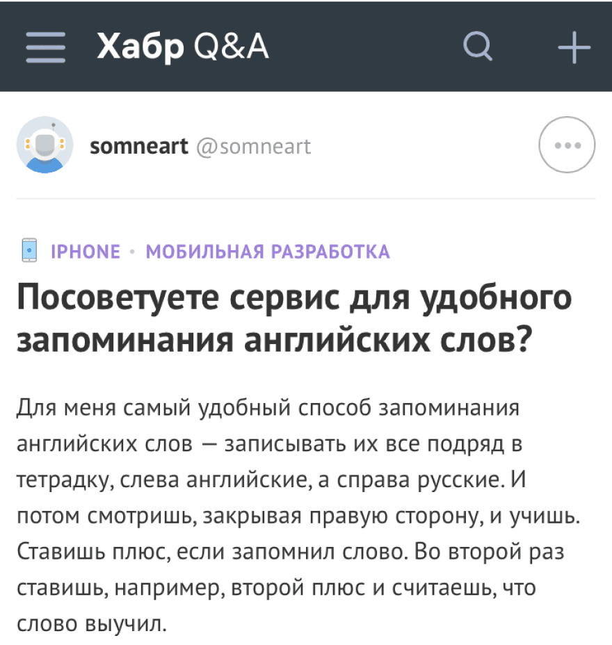
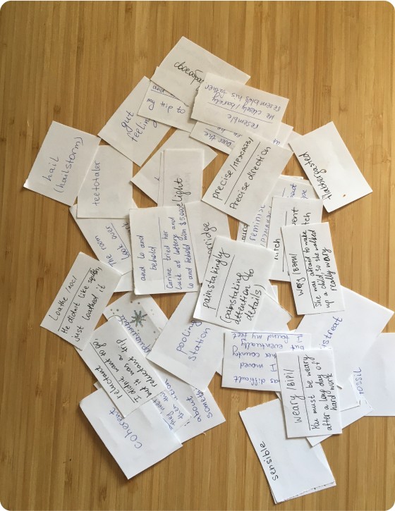
We asked our acquaintances on how do they learn new words. Most of them use paper flash cards or notes in the cell phone. Both of these options are inconvenient.
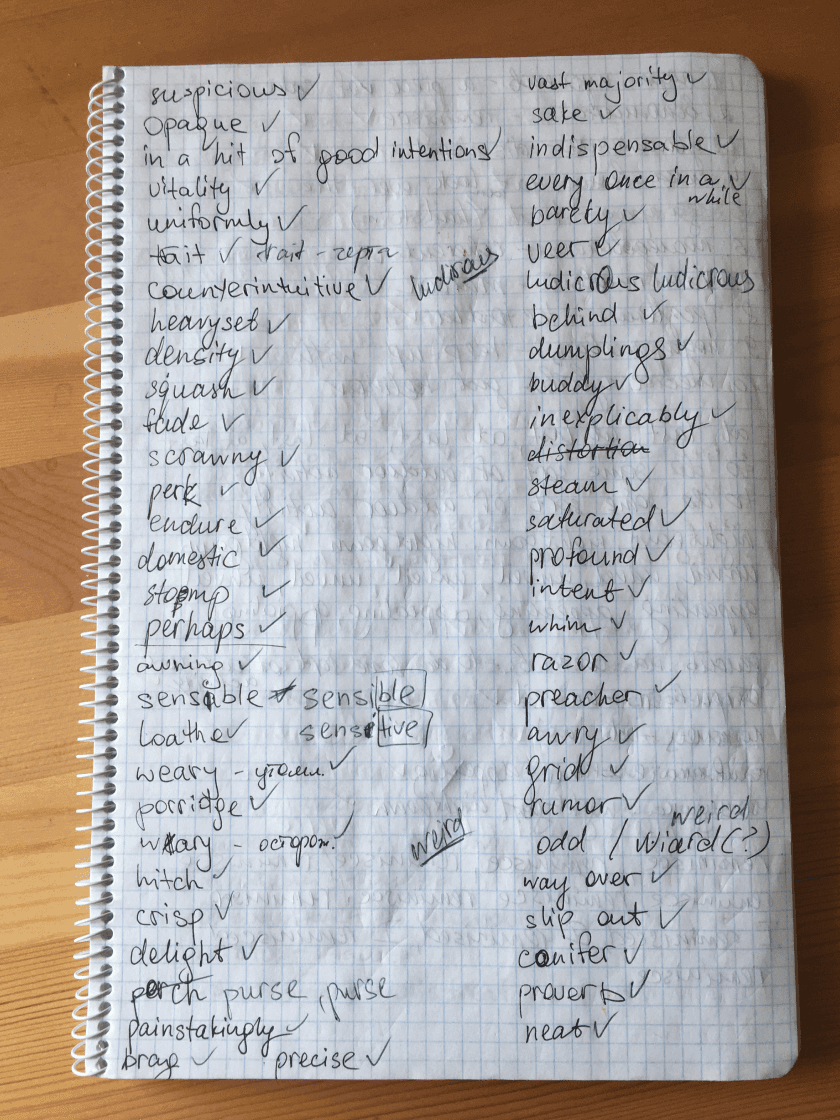
Some people write words in notebooks and learn by rewriting words.
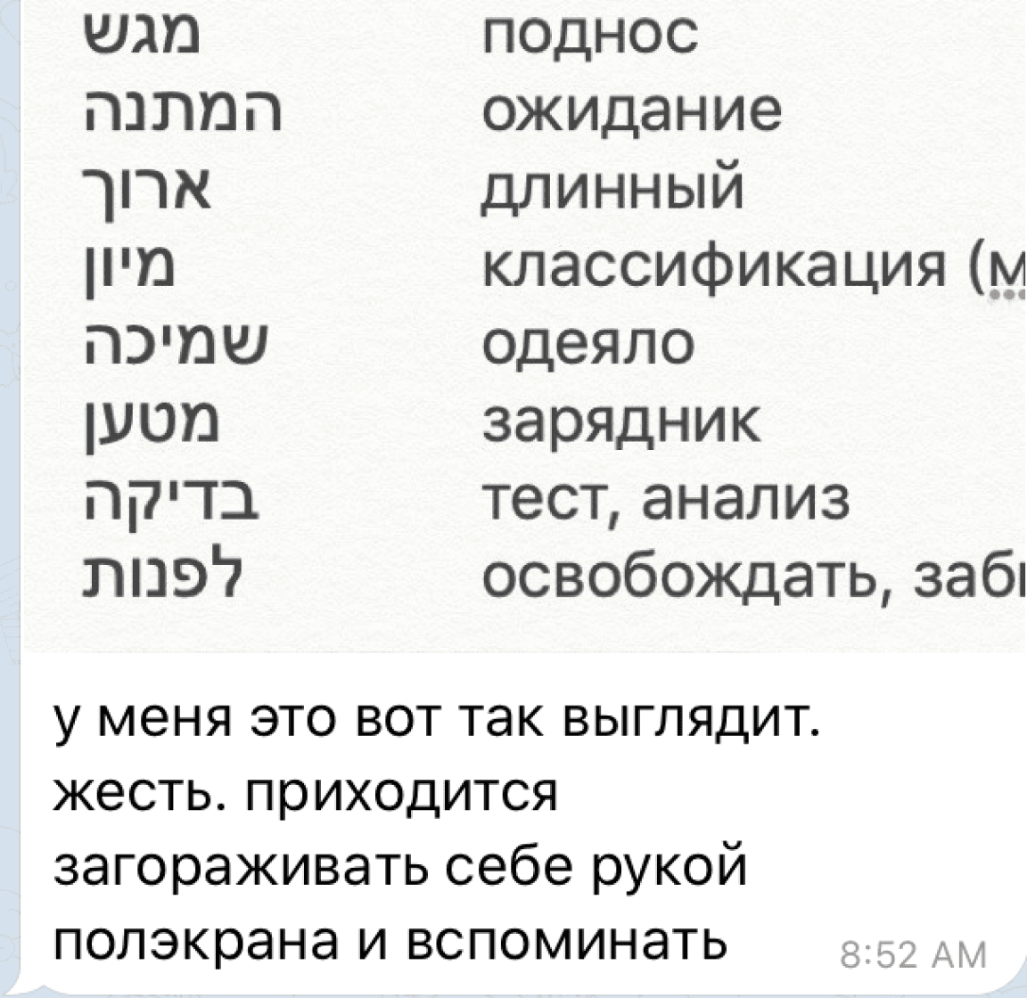
Some people write words in notes on their cell phone and learn them by covering one side of the screen.
Some people write words in notebooks and learn by rewriting words.
Research step 4
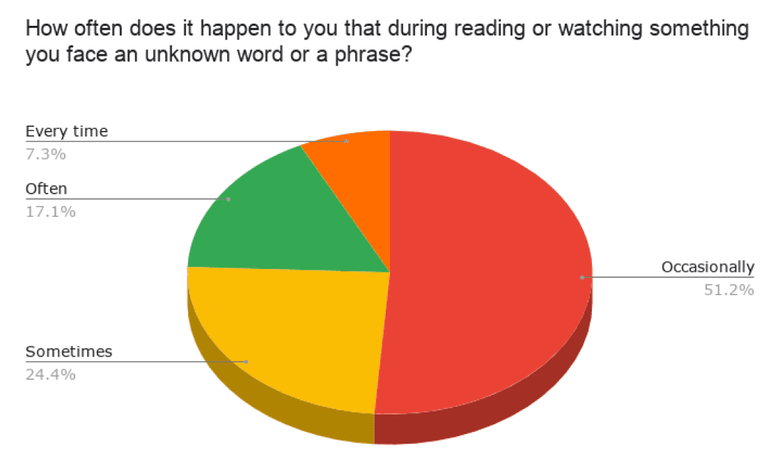
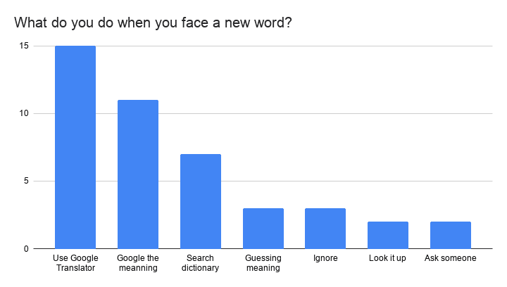
Survey Findings
We have conducted a Google questionnaire and received 40+ replies. A sample of the various sets of questions asked from the participants is shared here. Here are the main findings:
more often people face new words during reading than during watching.
when people face a new word or a phrase they usually translate it.
most of the interview participants use Duolingo, but it doesn’t have a feature of adding user’s own words

User flows & wireframes
Research helped me identify key user needs and create a user flow
Simple user flow helped me to visualize key actions users will be taking. Key user needs would be typing any word or a phrase nd typing in a custom translation or description of it, then practising these words and phrases in a way that would be efficient and fast. The clarity in visualization was helpful in further sketching process.
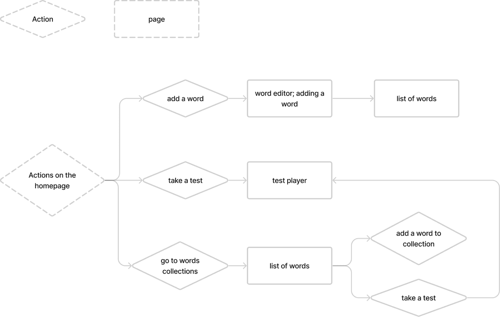
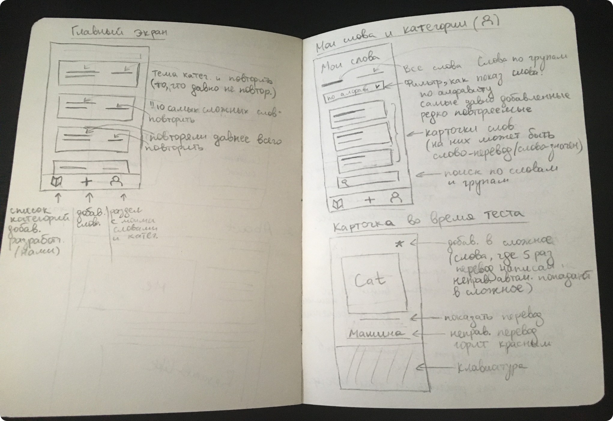
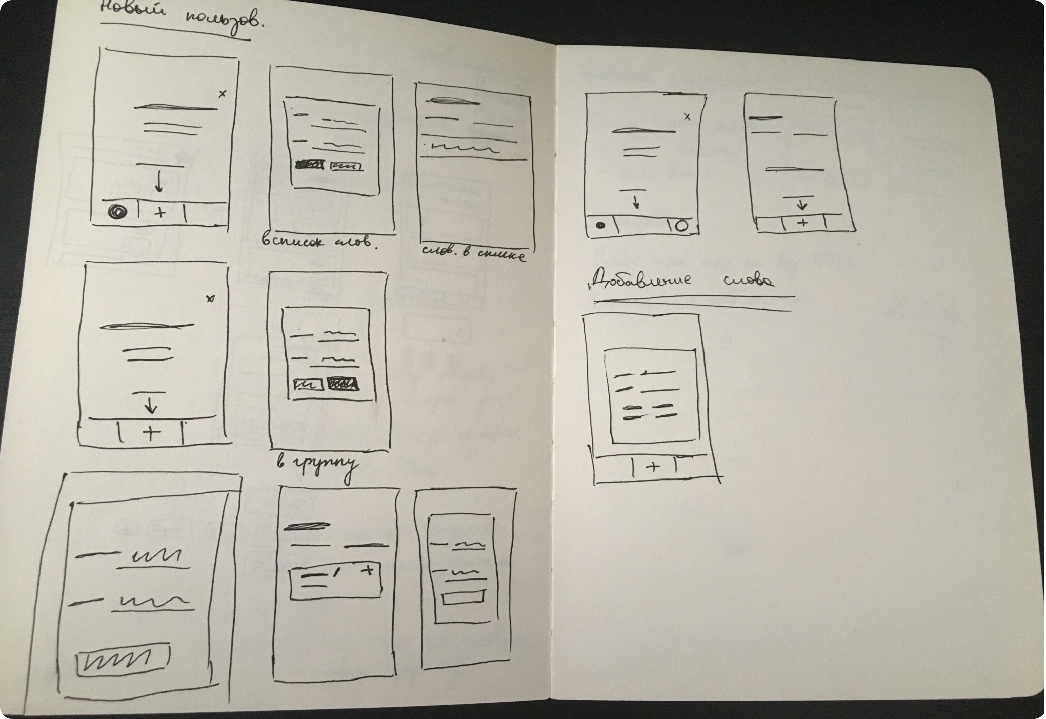
With preliminary user flow I determined what key screens we are going to have and I made sketches of those
Sketching on the paper allowed me keep focus on solving the problem without being encumbered by UI. It provided a space for brainstorming and allowed my imagination to flow freely, fostering creative exploration and ideation.
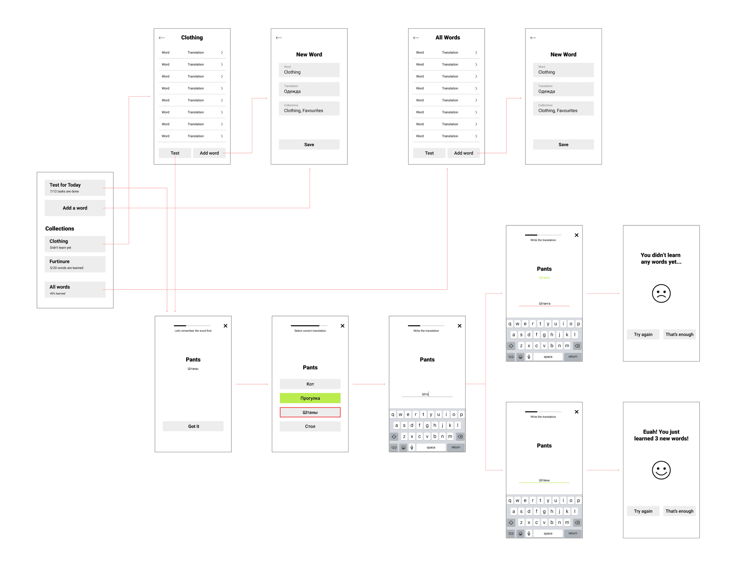
From sketches I created wireframes and a detailed user flow
After creating wireframes from my sketches I created a user flow with wireframes.
As I had wireframes ready, Graphic Designer and myself moved onto a search for a perfect UI style
We wanted to make an easy-to-use app that is visually pleasant to use. It should has the simple structure: user adds words or phrases and learn them by doing tests. We made around 200 layouts and 12 versions of the app design. Further I am gonna show the main steps of the UI design process.
Scroll right to see more ->

->
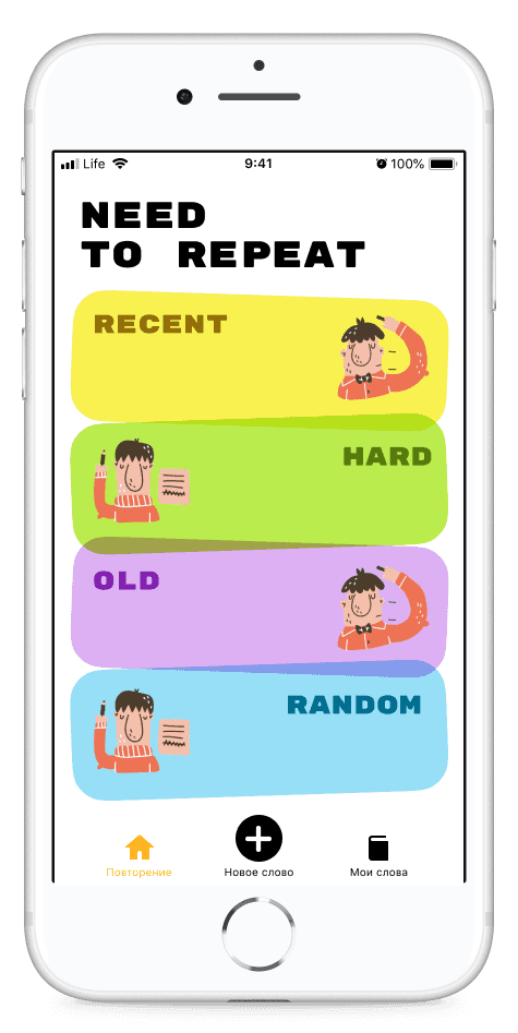
Instead of grouping words by categories we decided to group them by topics ‘hard’; ‘recent, etc.
->
->
Images were not in sync with the overall look of the app and were not providing any valuable info, so we decided to remove them.
->

->
Green gradient was supposed to showcase learner progress, but it was not clear. Also, large variety of gradients made the design look ‘messy’.
->
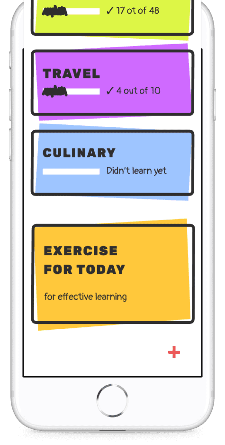
Homepage: view groups of words and start a test
Scroll right to see more ->

->
Modal pop up turns out to be inconvenient way of adding a word.
Also, it does not allow a learner to add a word to a group.
->
->
Design looks good, but very basic.
Also, instead of typing the whole collection(s) name(s), users should be able to pick up a collection from the existing one and type only in case the collection does not exist yet.
->

->
A bit too childish. Also title is too bold and tags with collections names are hard to read on gradient background
->
Word editor: Add a new word to collection or edit existing one
Scroll right to see more ->
->
Colours do not correlate with each other and do not meet usability standards.
->
->
Progress bar should be changed to meet the visual design of the app.
Gradients should be applied to the test screen to meet the overall app design.
->
->
Background for correct or incorrect answer is too bright. Cross button to close the test is too bold and attracts too much attention.
->
Test: practice words and phrases
Voila! Here is a final design in a user flow
We made Wordbook app from scratch in 3 months. We spent hours on research, created around 200 layouts and conducted over 20 meetings.
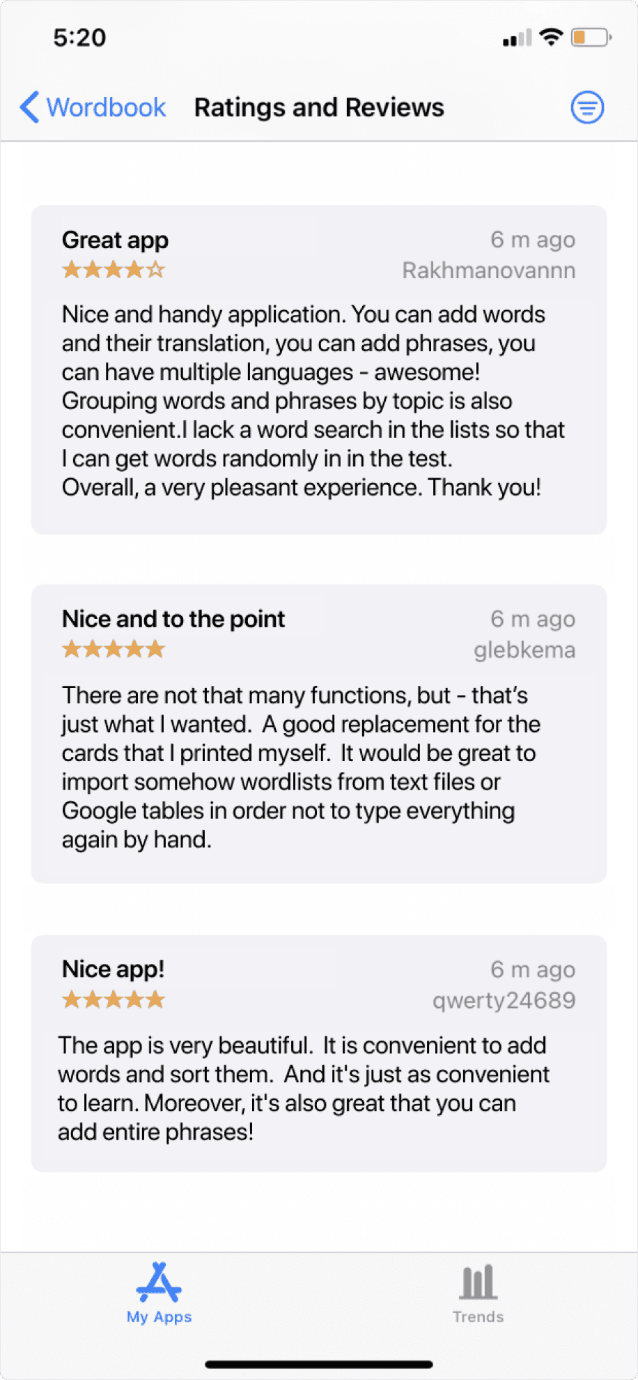
Wordbook got a high rating and was constantly downloaded despite zero promotion
Outcomes
4.4
App Store rating
125
Downloads a month on average without promotion
3 years
The app was available in App Store June 2020 to June 2023. Our team had ideas on continuing working on the app and adding advanced or paid features to motorize the project for the work we have done. In the end we realized that promoting a phone app and monetizing it is very complicated due to App Store restriction, some negative reviews and requests to fix bugs.
Final thoughts
What I have learned
Think outside the box
Do not try to implement the very first solution that came to your mind. It might seem like the best one, but there could be even a better one that is not that obvious. Try to think broad and search for unusual solutions.
Learn from others
It may happen that your team member who is not a designer may suggest a better solution to the problem. There is nothing wrong in learning from more experienced people. Just keep going on, be passionate and do your best.
Designing complex multi-persona tool to help finance organizations assess proficiency level of their employees
and see the Return On Investment of online training.
Displaying ROI
View another project
Hey there! To see the whole case study please switch to the desktop. Thanks!
🚧

Hey there! To see the whole case study please switch to the desktop. Thanks!
🚧